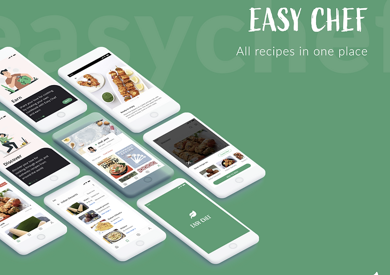
Easy Chef
A community for home chefs
Project Context
ROLE
Product Designer + User Researcher + Product Strategy
TOOLS
Adobe XD
CONTEXT
Undergraduate Final Studio Project (2020) | Passion Project
The WHY
The pandemic confined us to our homes, disrupting the traditional ways people connect over shared meals. Recognizing the significance of food in human connections, especially through gatherings for coffee, lunches, and dinners, the limitations imposed by the pandemic prompted a shift to digital connections.
With more people turning to home cooking and sharing their culinary creations on platforms like Instagram and TikTok, a crucial question emerged - How can we create a user-centric community to facilitate global connections and the sharing of diverse recipes?

Design Process

User Research
PRIMARY RESEARCH
USER INTERVIEWS | 1-1 interviews
1. Understand the behaviour patterns that arise before, during, and after
cooking.
2. Understand their experience using existing media platforms like instagram and whatsapp.
3. What does does the action of sharing recipes play in their community?

USER SURVEYS
The aim of the surveys was to gather quantitative data on:
1. Age group of users
2. Number of times content is shared/posted per week
3. Avenues used to share recipe content
4. Participants who also refer to recipes posted on digital platforms
FLY ON THE WALL
I used this method to observe and validate what user's said v.
what they actually did.


Who, What, Where, Why, How


Ideation
Mind Map Insights
The product spans across 4 core features: Share, Seek, Store and Sell.
Some design principles overlap across all 4 features:
1. Improvement in readability - improving usability
2. Information priority (hierarchy)
3. Consistency (bringing in familiarity)
4. Context (Images paired with text)
5. Meeting user needs across all 4 features.


Mash Ups
I combined interactions, behaviours and experiences from food, social media and e-commerce sector to generate ideas. From this process, I generated 3 possible mash-ups as seen in the image.
Define
User needs and Features
Following the mindmap, the 4 basic actions a user would perform on the platform were used to define features and functions

Design Direction ➡️
Creating more usable systems requires focusing on users and their tasks
-
Determine who will use the system for what purposes
-
Focus early on is getting to know the users and tasks
-
Task-centered design requires the selection of representative tasks
-
Representative tasks keeps the design focused on users and usability
-
Identify user-friendly interfaces and incorporate those ideas into your systems
TASK FLOW

USER JOURNEY MAP
The storyline of every engagement the user would have from the time they discover the product till they become loyal users.

UI DESIGN SYSTEM
I selected green as the primary color based on its alignment with the KISS metrics, ranking it among the top four widely accepted colors for mobile apps. Additionally, green is associated with freshness, reinforcing the motto: "Empowering everyone to prepare fresh meals"

PROTOTYPE

FEEDBACK
-
⚠️ I observed that the placement of the close button towards the left of the screen for the bottom sheet made it difficult to reach.
-
⚠️ Increase the width of the 'Add to Box' button. I observed that people with wider fingers taped outside the button, though this was rare.
-
♥️ User's easily understood what the product was about and the functions they could perform.
-
♥️ They appreciated way they could view each step of a recipe - Story viewing style inspired by Instagram.